What Great “Benefits Pages” Include (And What To Remove)
Benefits pages are one of the most underestimated trust artifacts on a careers site. Candidates don’t treat them like a nice-to-have. They treat them like evidence. Not evidence that a company has perks, but evidence that the company can explain real life support clearly, without spin.
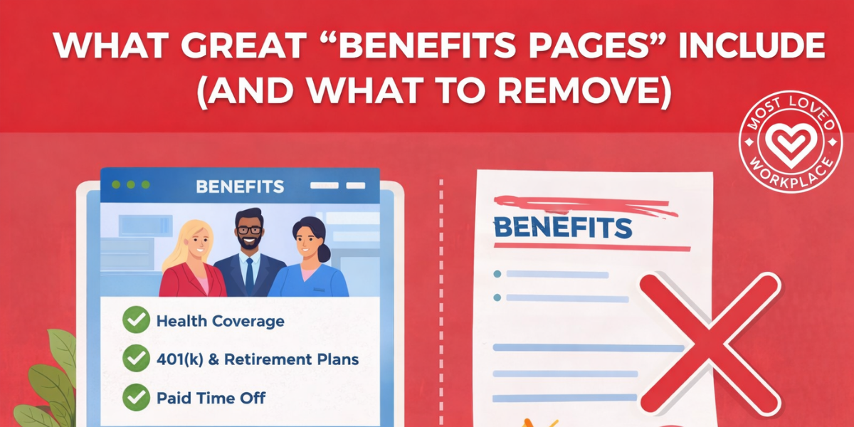
Most benefits pages fail in the same predictable way. They either read like an HR handbook pasted onto a web page, or they drift into “perk theatre”—a long list of shiny items that hides the basics people actually need to evaluate. The result is confusion, unnecessary back-and-forth, and a quiet signal to candidates that communication inside the company is probably just as messy.
This piece breaks down what great benefits pages include, what to remove, and the specific mechanisms that make the page usable for humans—without turning it into a legal document or a marketing pitch.
A Benefits Page Isn’t A Perk List—It’s A Clarity Test
Candidates don’t read benefits pages the way internal teams write them. They skim. They look for anchors: healthcare, time off, flexibility, financial security, and whether the company explains things like an adult speaking to another adult. If the page is vague, overly polished, or hard to navigate, people don’t just assume the benefits are unclear. They assume the culture will be too.
There’s also a simple market reality: benefits are a core decision factor, not a fringe one. Indeed’s Hiring Lab found that nearly half of U.S. job seekers in its survey selected “better benefits” as something they were looking for in a new job, making it one of the most common motivators after pay.
A great benefits page, then, is less about “selling” and more about reducing uncertainty. It answers the obvious questions quickly, makes the tradeoffs visible, and shows that the company respects the reader’s time.
What Great Benefits Pages Include
Great pages follow a simple rule: answer what a smart candidate will ask in the first three minutes, then offer deeper details without friction. The structure matters as much as the content, because most people are scanning on mobile, skimming between meetings, or comparing multiple companies side-by-side.
A One-Screen Benefits Snapshot
Start with a scannable snapshot that shows the categories people care about most. Think of it as the “table of contents” for the page, not the full explanation. It should make it immediately clear whether you offer health coverage, time off, flexibility, retirement, and development support.
Right beneath the snapshot, add the context that prevents misunderstandings: who the benefits apply to (full-time, part-time, location-based eligibility), when coverage starts, and where details vary by country or state. You don’t need to publish every exception. You do need to acknowledge where the differences live.
Core Protection Benefits, Explained In Plain English
Most candidates are trying to answer a practical question: “If something happens to me or my family, am I covered?” That means medical, dental, vision, life insurance, and disability. The page should name them clearly and explain them simply.
The trap is over-explaining plan design in jargon. You don’t need to teach a benefits class. You need to define unavoidable terms with one-line clarity. If you mention deductibles, copays, or networks, include a short “what this means” sentence so a reader doesn’t have to translate.
Time Off And Flexibility, Stated Like Policy—Not Poetry
If your page says “we value work-life balance,” candidates will move on. They’ve read that sentence a thousand times. What they want to know is how time is actually taken and how flexible work is actually practiced.
A strong benefits page states PTO, sick time, holidays, and parental leave in straightforward terms, then clarifies how it works in reality. Is PTO combined or separated? Is approval manager-dependent or policy-defined? Is flexibility role-based? If the answer is “it depends,” name what it depends on. Clarity beats perfection here.
Mental Health And Wellbeing Support That Feels Real
Many companies mention wellness. Fewer explain access. A benefits page should highlight mental health support (EAP, therapy coverage, telehealth, coaching, crisis resources) and do one crucial thing: show the pathway.
How do employees actually use it? Is it a portal, a phone line, a provider directory, a dedicated partner? What’s the privacy boundary? People don’t need clinical details. They do need reassurance that accessing mental health support won’t become a performance conversation later.
Financial Wellbeing And Long-Term Security
For many candidates, the retirement plan is the “seriousness” signal. If you offer a 401(k) match, say so plainly. If you provide an HSA/FSA, explain what it’s for and how employees typically use it. If you mention equity or bonuses, be careful with promises, but don’t hide behind vague phrasing like “competitive.”
This is also where benefits communication often breaks down internally. Aflac’s WorkForces reporting notes that many employees still don’t fully understand their policies, even as understanding has improved. That’s a strong argument for plain-language explanations and self-serve clarity—because confusion is expensive for employees and for HR.
Growth Benefits That Connect To Careers
Career development shouldn’t be a single line item that says “we invest in learning.” If you offer tuition reimbursement, certifications, a learning stipend, or internal mobility support, explain how it works in one clean paragraph.
What’s the eligibility threshold? What’s the approval process? What does “typical use” look like? This is where candidates look for credibility. A page that offers growth benefits without mechanisms reads like aspiration, not support.
Voluntary Benefits, Positioned As Add-Ons
Voluntary benefits can be valuable—pet insurance, student loan support, identity protection, critical illness coverage—but they shouldn’t lead the page. When companies put the add-ons front and center, it can look like they’re trying to distract from thin fundamentals.
List voluntary benefits as optional enhancements. Make them easy to find, but don’t let them eclipse healthcare, time off, flexibility, and retirement.
A Real “Need Help?” Contact Path
This is where trust gets won or lost in practice. Great benefits pages include a clear support path: an inbox or portal link, what that channel is for, and what response time looks like. If you have a benefits administrator or People Ops team that handles questions, say so. If there’s a “during open enrollment” surge, acknowledge it and set expectations.
A benefits page is not just for hiring. Employees use it too. When the page ends without a path to help, it quietly communicates that support is hard to access.
How To Structure It So Humans Actually Use It
Most benefits pages fail on information design, not on the existence of benefits. The fix is reducing cognitive load. If the page makes it easy to scan, understand, and go deeper, candidates will stay longer, ask better questions, and trust the company more quickly.
The Three-Layer Page Model
A strong benefits page often behaves like three pages in one.
The first layer is the scan layer: cards, headings, and short summaries that help someone get oriented fast. The second layer is the understand layer: plain-language explanations and “what to do next” guidance. The third layer is the deep layer: links to plan documents, handbooks, and legal details for people who need them.
This model keeps the page readable without withholding details. It respects both the skimmer and the careful evaluator.
Organise By Life Moments, Not HR Categories
People don’t think in plan types. They think in life events. A better structure often includes sections like: “Starting Here,” “Growing Your Family,” “Managing Health,” “Caregiving,” “Time Off and Recovery,” and “Planning Long-Term.”
This is not a design preference. It’s a comprehension tool. It reduces the need for benefits fluency and makes the page feel more humane without becoming sentimental.
Make It Accessible: Mobile, Readability, And Findability
If the benefits page is only useful on desktop, it’s already behind. Use short sections with clear headings, jump links near the top, and an experience that doesn’t require opening multiple PDFs to find basic answers.
Language matters here, too. Overuse of business jargon creates barriers and causes people to tune out, which is exactly what you don’t want on a page built to reduce confusion. A benefits page should be one of the most jargon-free pages on the site.
Add Lightweight Tools Only Where They Truly Help
Interactive elements can be useful, but only when they reduce work for the reader. A simple HSA/FSA explainer or a “who should I contact?” decision tree can prevent dozens of repetitive questions.
Avoid adding tools for the sake of seeming modern. If it doesn’t reduce confusion or improve action, it becomes clutter.
What To Remove: The Trust-Killers
Cutting is where most benefits pages improve fastest. When you remove friction and “marketing smell,” the fundamentals get easier to see—and the page starts doing its job.
Jargon And Legalistic HR Copy
If a sentence makes sense only to someone who works in benefits administration, rewrite it. You can still be accurate without sounding like a policy manual. Legal detail belongs in plan documents. The careers site page should be a clarity layer that points to the detail, not the detail itself.
Outdated Details And “Last Year’s Benefits”
Nothing erodes trust faster than stale information. If a candidate sees an outdated plan year, an expired benefit, or a broken link, they assume the company is disorganised or hiding something.
A simple fix is adding “Last Updated” at the top and assigning an owner plus a review cadence. Treat the page like a living asset, not a static brochure.
Redundancy And Perk Dumping
Repeating the same explanation across multiple sections makes the page longer without making it clearer. Consolidate. Link. Keep one authoritative explanation per category and point deeper with clean anchor links.
Perk dumping has the same problem. A list of 40 small perks rarely persuades. It often creates suspicion that the company is compensating for weak core support.
Walls Of Text That Hide Real Answers
If someone can’t quickly find healthcare, PTO, flexibility, and retirement, the page is failing. Most benefits pages don’t need more words. They need stronger headings, shorter explanations, and better prioritisation.
Unnecessary Clicks And Gated Information
A benefits page isn’t a scavenger hunt. If basic answers require five clicks, a PDF download, and a separate portal login, many candidates will abandon the effort. Keep key answers within one to two clicks, and reserve gates for truly sensitive information.
Irrelevant “Showy” Perks That Don’t Help
If resources are limited, prioritise the benefits that change outcomes: healthcare access, time off, flexibility, parental support, and financial stability. The goal isn’t to be flashy. It’s to be real.
A Simple Benefits Page Audit Framework
If you need a leadership-friendly way to review a benefits page without getting pulled into endless debate, use a framework that forces specificity.
Start with clarity: can a smart candidate understand the core offer in three minutes without HR translation? Then credibility: are you using mechanisms and numbers where appropriate, or hiding behind “generous” and “competitive”? Then coverage: are the fundamentals easy to find and explained in plain language?
Finally, check findability and freshness. Findability means the top questions are answerable in under 90 seconds. Freshness means there’s a named owner and a review cadence, so the page doesn’t decay quietly.
The point of the audit isn’t perfection. It’s usability. A benefits page that is clear, current, and navigable will outperform a page that tries to be comprehensive but unreadable.
What Healthy Cultures Make Visible
In MLW-aligned cultures, benefits pages tend to read like operating manuals for support: clear, humane, and specific. Not because the company is trying to impress candidates, but because it’s reflecting how the organisation communicates internally.
You can see this standard across very different MLW-certified companies—names like Automattic, Inc., 8×8, Inc., and Synopsys Inc.—where the credibility signal isn’t “we have everything,” but “we explain what we offer in a way people can actually use.” The strongest pages don’t overclaim. They reduce uncertainty, point to help, and make the experience feel calm.
The recurring pattern is simple: fewer slogans, more mechanisms. Life-moment organisation. Plain-language explanations. A clear support path. A page that respects the reader enough to be straightforward.
Leadership Takeaway
A great benefits page doesn’t need to be longer. It needs to be clearer.
If you want to improve yours quickly, rewrite the top sections in plain language, add a one-screen snapshot, and make the “how it works” paths visible—especially for time off, flexibility, and mental health support. Then cut jargon, remove stale content, and reduce unnecessary clicks until the page feels like a tool, not a brochure.
The best benefits pages do something quietly powerful: they make support feel real before someone ever applies. That’s not marketing. That’s trust-building through clarity.
Frequently Asked Questions
What Should A Company Benefits Page Include?
Include a scannable snapshot, core protection benefits, time off and flexibility, mental health support, retirement and financial benefits, growth benefits, voluntary add-ons, and a clear contact path for questions.
What Benefits Do Candidates Care About Most Right Now?
Traditional fundamentals still matter: healthcare, paid leave, and core security benefits. Survey data suggests “better benefits” remains a major motivator for job seekers.
Should We Publish Exact PTO Days And 401(k) Match Numbers?
If your numbers are stable and broadly applicable, publishing them increases trust and reduces candidate uncertainty. If they vary by location or tenure, disclose the structure and note where specifics differ.
What’s The Difference Between Benefits And Perks?
Benefits typically cover protection and security (healthcare, retirement, leave). Perks are add-ons (snacks, discounts, swag). A great benefits page leads with benefits and positions perks as optional extras.
How Do We Make Benefits Easy To Understand Without Jargon?
Use plain-language headings, define unavoidable terms in one line, organise by life moments, and link to detailed plan documents for those who want depth. Overuse of jargon reliably reduces comprehension and engagement.
How Should We Organise Benefits—By Plan Type Or Life Events?
Life-event organisation is usually more usable for candidates and employees because it mirrors how people make decisions (family changes, health needs, caregiving, financial planning).
What Should We Remove From A Benefits Page To Increase Trust?
Remove jargon-heavy paragraphs, outdated details, redundant text, walls of copy, unnecessary clicks, and “perk dumping” that distracts from core support.
How Often Should A Benefits Page Be Updated?
At minimum: quarterly review and an update during open enrollment changes. Add a “Last Updated” line and assign a named owner so accuracy doesn’t decay over time.

Louis Carter is the founder and CEO of Best Practice Institute, Most Loved Workplace, and Results-Based Culture. Author of In Great Company, Change Champions Field Guide, and Best Practices in Talent Management, as well as a series of Leadership Development books. He is a trusted strategic advisor and coach to CEOs, CHROs, and leaders of mid-sized to F500 companies – enabling change and steering employer brand development together with highly effective teams, leaders, and organizations as a whole.

0 Comments